Pin & Poke
Brand Identity / Website Design / Illustration
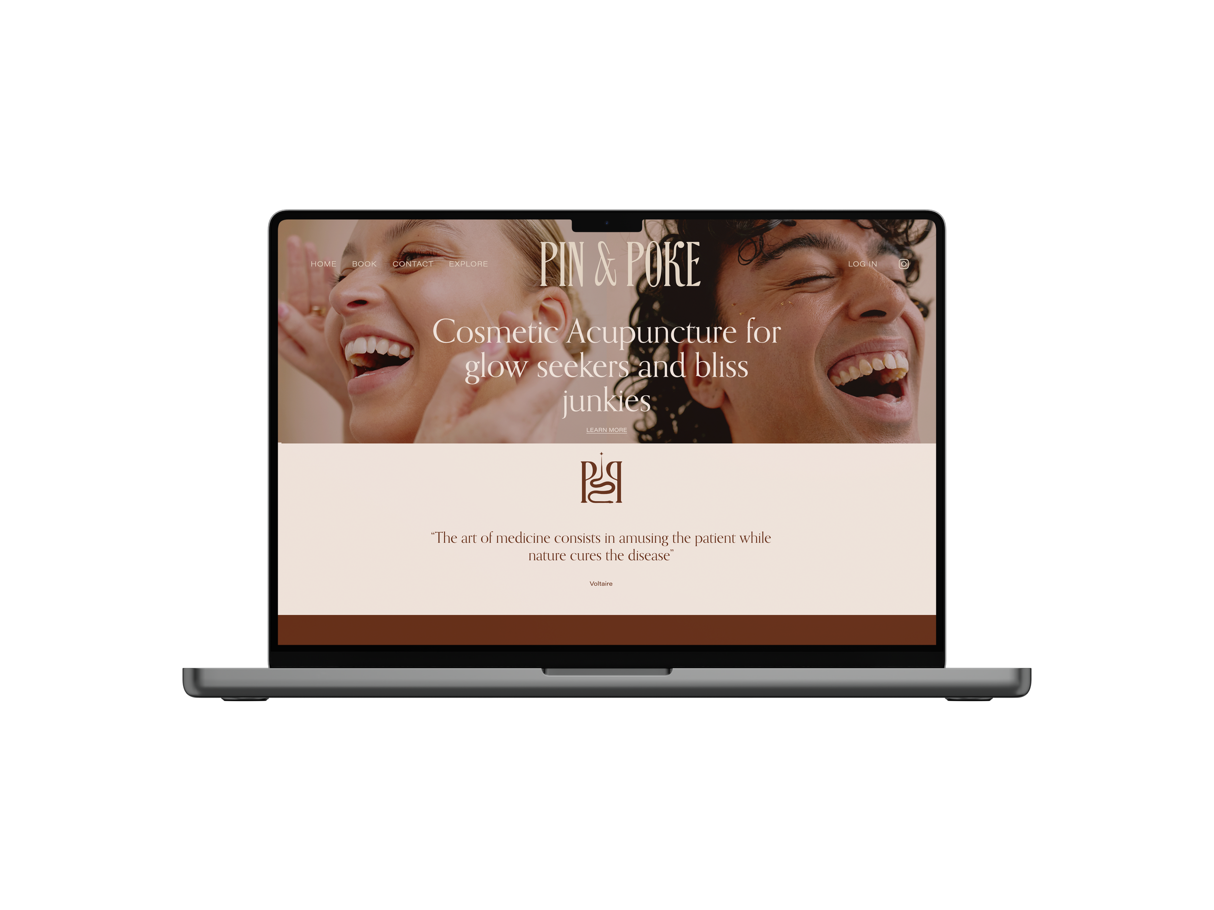
Pin and Poke is a facial acupuncturist brand started by Harriett Hare. Pin & Poke aims to enter the world of acupuncture and healing with a fresh approach, positivity and a touch of ‘witchy’ energy. Harriett wanted to create an identity that touched on her fascination with witchcraft, yet still felt fresh, chic and timeless.
Early 1800s fairytale books lead the typography; I altered the ‘N’ to create a pin-like shape and sourced the ampersand from a chinese-inspired font to hint at the ancient practice of acupuncture. Two brand symbols live as secondary visual elements for the brand – the first being two Ps holding a snake and needle shape, and the other a witchy fairy adapted from the cover of “The Witching Hour’ by Augustus Thomas.


Kind words
“I first came across Lucy’s work by falling in love with someone else’s branding. I had never worked with a graphic designer before and didn’t really know what to expect.
I was absolutely blown with her talent and the process she guided me through. The detail, creativity and generosity Lucy infuses in her work is incredible.
After a few weeks she had created a portfolio of branding that had surpassed my expectations and gets compliments every where I go!
Since then Lucy has created bespoke images for my worshops and has created and developed my website.
The first thing anyone says when engaging with me is YOUR BRANDING IS INCREDIBLE. And it’s all down to Lucy.”
– Harriet Hare, Founder, Pin & Poke